March 11, 2015
BY Dave Mason

At Mantis Technologies, we have been advocating the use of mobile friendly websites as mobile usage continues to grow.
It has been predicted that this year, mobile usage will surpass desktop usage for accessing the Internet and it looks like that may have already happened. In response to this, Google has been advising businesses for the past year or so to ensure their website is mobile friendly and earlier this year they started informing some business owners if they have detected mobile usability issues on their website.
Recently, Google has made an official announcement that as of April 21 2015, they will now use 'mobile compatibility' as a ranking signal. This is very important news as Google rarely informs the public what their ranking signals are. Furthermore, Google have said that after April 21, they will penalise sites that do not have a 'mobile compatibility' and users searching on mobile devices will no longer see these sites. Google have also said that they will award a boost in rankings to sites that do support mobile.
This means that it is now essential for all websites to either be 'mobile responsive' or have a dedicated mobile site.
Getting your website mobile friendly is now the most critical and best investment a business can make in their website. However it is also important to choose the right solution for your site.
 What to support
When we talk about mobile support, it is important to note that mobile covers various devices. You need to make sure your website is supported on both tablets and smartphones. This means that your website should work well on Ipads, Android tablets, Microsoft Surface and all other tablets.
It is also important to ensure the website works well on various smartphones such as Iphones, Android phones and Windows phones.
When working on a tablet (such as an ipad), your site should scale and fit nicely without needing scrolling to the left or right. You should also ensure that flash components (like flash slideshows, flash menu's and flash animations) are not used as they are not supported on Ipads (or Iphones). Your menus and other interfaces should also work with touch screens.
When working on a phone, the website should show in an interface that is designed for mobile usage. Mobile users tend to be paying for data so the website should be quick, easy to navigate and not have large images or files that it downloads.
Responsive design Vs dedicated mobile site
There are two ways you can make your website support mobile.
The first is 'responsive design'.
This is a type of coding that resizes the website and shows/hides components based on the device you are using. The advantage of responsive design is that the site can be easy to maintain and make changes but the disadvantage of responsive design is that it does not give you much flexibility for how a smartphone version of the site works from a functionality point of view. An example of responsive design is www.mantistech.com.au
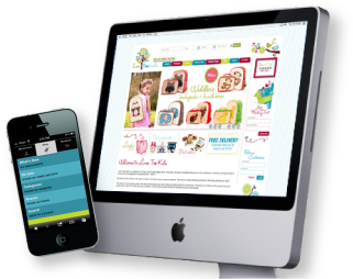
The second type of mobile support is a dedicated mobile site. When implementing this option, you would ensure that your main site works on desktop computers and tablets and then you have a seperate site designed specifically for mobiles. The advantage of a dedicated mobile site is that you can specifically design the functionality for mobile users and the disadvantage is that it generally requires more work to initially set up. An example of a site that uses a dedicated mobile site is www.limetreekids.com.au. When getting a dedicated mobile site developed, it is also important to ensure it is plugged into your existing CMS so that it draws the same information as your main site and you don't have to maintain two seperate websites.
At the end of the day, Google does not care which option you choose, as long as your site is supported on desktops, tablets and smartphones. We have tested both of these methods with Google and they are both accepted with no benefit or disadvantage to either.
Different options are applicable for different circumstances. Responsive design can be a quick and easy way to offer mobile support when you are building your site for the first time or getting a reskin but if you have an existing, established design or you want to fine tune the experience for users on mobile devices then we find a dedicated mobile site can be the best option.
Special Offer
For this month only, we are offering a special deal to existing clients of Mantis Technologies who want to ensure their website is mobile friendly and passes Google's checks for mobile compatibility. For more information on this amazing deal, click here
